CSS latest and most complete 20 interview questions
1. BFC: block-level formatting context (focus)
BFCBasic Concept: BFC is a concept of CSS layout, which is an independent rendering area (environment), and the elements inside will not affect the external elements.
BFC principle (rendering rules, layout rules):
(1) The inner Boxes will be placed one after the other from the top in the vertical direction;
(2) The vertical distance of the Box is determined by the marain, and the margins of two adjacent Boxes belonging to the same BFC will overlap;
(3) The left side of each element's margin Box touches the left side of the containing block's border Box (for left-to-right formatting, otherwise vice versa). This is true even in the presence of floats;
eg: Left floating means that the left side of the child div touches the left side of the borderbox of the parent div, and right floating means that the child div touches the right side of the borderbox of the parent div
(4) BFC is an isolated independent container on the page, and the elements outside will not affect the elements inside, and vice versa.
BFC layout rules:
(5) The BFC area will not overlap with the float Box (that is, clear the float)
(6) When calculating the height of BFC, floating elements also participate in the calculation.
BFC triggering condition (i.e. out of document flow)
- The root element, the HTML element (the largest BFC)
- float (the value of float is not none)
- Positioning (the value of position is absolute or fixed)
- Table unit (display is
table, table-cell, table-caption, inline-blockand other attributes related to HTML tables) - Flexbox (display is
flexorinline-flex) - overflow is not visible
BFCFunction (Application Scenario)
1. Adaptive two (three) column layout (to avoid multi-column layout due to the rounding of width calculation and automatic line break)
2. Avoid elements being covered by floating elements
3. Make the height of the parent element include the child floating element, clear the internal float (principle: trigger the BFC attribute of the parent div, so that the following child divs are all in the same BFC area of the parent div)
4. Use different BFCs to prevent margin overlap
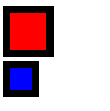
2. CSS box model
CSS box model: standard box model, IE box model (weird box model)
the difference:
Standard box model width and height = content + border + padding + margin
IE box model width and height = margin+content (content contains border + padding)
That is to say, if the standard box model increases the padding and border, the box will be enlarged, but the IE box model will not be enlarged, but the content will usually be reduced.
Defaults to the standard box model
Transformation of the CSS box model:
box-sizing: content-box; /*standard box model*/
box-sizing: border-box; /*IE box model*/
<style>
  .box2 {
    margin-bottom: 10px;
    width: 100px;
    border: 20px solid black;
    height: 100px;
    background-color: red;
  }

  .box3 {
    box-sizing: border-box;
    margin-top: 10px;
    width: 100px;
      border: 20px solid black;
    height: 100px;
    background-color: blue;
  }
</style>
<div class="box2"></div>
<div class="box3"></div>
3. Clear the float
- Define the height separately for the parent element
The advantages are simple and less code; the disadvantage is that responsive layout cannot be performed - Add overflow to the container of the floating element: hidden
The advantages are simple and the compatibility is high; the disadvantage: the excess part is hidden - Add an empty tag with the clear:both attribute after the floating element
Advantages: less simple code, high compatibility; Disadvantages: adding meaningless empty tags is not conducive to page optimization and later maintenance -
:after pseudo-element method(most recommended) must have the attribute
content display clear
Advantages: fixed writing, high compatibility; Disadvantages: many codes<style> .box { border: 1px solid black; padding: 5px; width: 450px; /* overflow: hidden; Method 2: Add overflow: hidden to the parent element; */ } /* Method 3: Pseudo-element (recommended) */ .box:after { content: ''; display: block; height: 0; visibility: hidden; clear: both; } .left { width: 100px; height: 100px; background-color: red; float: left; } .right { width: 100px; height: 100px; background-color: red; float: right; } /* .clean{ clear: both; } */ </style> <body> <div class="box"> <div class="left"></div> <div class="right"></div> <!-- Method 1: Add a label --> <!-- <div class="clean"></div> --> </div> </body>
4. Methods of hiding elements and their respective characteristics
- rgba(0,0,0,0) /* occupies space, can respond to click events */
- opacity:0 /* Occupies space, can respond to click events, will child elements inherit, cannot be hidden in screen reader software*/
- overflow: hidden /* used to hide the overflow part of the element, occupying space, unable to respond to click events*/
- visibility:hidden /* takes up space, not clickable : The only difference from opacity is that it will not respond to any user interaction. In addition, the element will be hidden in screen readers */
- transform: scale(0,0) /* occupies space, cannot be clicked */
- display: none /* does not occupy space, cannot be clicked */
- z-index:-1000 /* Does not occupy space, cannot be clicked */
- position: absolute;
left:-99999px;
top:-90999px; /* Does not occupy space, cannot be clicked */
5. The difference between line-height and height
line-height: The height of each line of text, if the text wraps, the height of the entire box will increase (height=number of lines*line height).
height: Fixed value, that is, the height of the box.
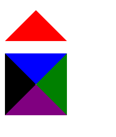
6. Draw a triangle with CSS
Draw a triangle facing a certain direction as required, and set the other three borders to be transparent
<style>
    div{
        width: 0;
        height: 0;
        border: 50px solid transparent;
        border-bottom:50px solid red;
    }
    .all{
        margin-top: 20px;
         width: 0;
        height: 0;
        border: 50px solid transparent;
        border-color: blue green purple black;
    }
</style>
<div></div>
<div class="all"></div>
7. Holy Grail layout
the three-column layout is fixed on both sides and the middle is self-adaptive, which is consistent with the problem solved by the double-flying wing layout
example:100px on both sides, adaptive in the middle
  <body>
    <div class="left"></div>
     <div class="middle"></div>
    <div class="right"></div>
  </body>
-
Use flex layout: left and right fixed width middle flex: 1
/* Method 1: flex layout */ body { display: flex; } .left{ width: 100px; height: 500px; background-color: aquamarine; } .middle{ flex: 1; /* Occupy the remaining space */ background-color: lightsalmon } .right{ width: 100px; height: 500px; background-color: red; } -
Absolute positioning method: the left and right columns adopt absolute positioning, and are respectively fixed on the left and right sides of the page, and the middle main column uses the left and right margin values to spread the distance
<style> body { position: relative; margin: 0; } .left { position: absolute; width: 100px; height: 500px; background-color: aquamarine; left: 0; top: 0; } .right { width: 100px; height: 500px; position: absolute; background-color: red; right: 0; top: 0; } .middle { height: 500px; margin-left: 100px; margin-right: 100px; background-color: lightsalmon; } </style> -
Self-floating method: the left column floats left, the right column floats right, put the middle column at the end
  .left {
     float: left;
      width: 100px;
      height: 500px;
      background-color: aquamarine;
    }
    .right {
      width: 100px;
      height: 500px;
     float: right;
      background-color: red;
    }
    .middle {
      height: 500px;
      background-color: lightsalmon;
    }
  <body>
    <div class="left"></div>
    <div class="right"></div>
    <div class="middle">25484868</div>
  </body>
8. Draw a 0.5px line
-
Use the meta viewport method (viewport is only for the mobile terminal, and the effect can only be seen on the mobile terminal)
<meta name="viewport" content="width=device-width, initial-scale=0.5"/> -
Adopt transform: scale()
<style>
    div{
        margin: 50px;
        width: 150px;
        height: 1px;
        background-color: aqua;
        transform: scaleY(0.5);
    }
</style>
<body>
    <div></div>
</body>
9.Implement an adaptive square
<style>
     .placeholder {
       background-color: aqua;
       /* width: 100%;
       padding-bottom: 100%;
       height: 0; */
       /* method two */
       /* width: 100%;
       height: 100vw; */

       /* method three */
       width: 100%;
     }
     .placeholder:after {
       content: "";
       display: block;
       padding-top: 100%; /* The padding percentage is calculated relative to the width of the parent element */
       /*If margin-top: 100% is used above; it may appear that the outer margin of the container and pseudo-element collapses, and it needs to be added
       overflow: hidden;*/
     }
   </style>
   <body>
     <div class="placeholder"></div>
   </body>
10. Horizontal and vertical centering problems
Fixed width and height
Center horizontally
-
method one: margin: auto;
div { width: 500px; height: 200px; background-color: blue; margin: auto; } </style> <div></div> -
parent element text-align: center; child element display: inline-block;
<style> body{ text-align: center; } div{ width: 500px; height: 200px; background-color: blue; display: inline-block; } </style> <div></div> -
Flex layout
  body{
          display: flex;
        justify-content: center;
    }
    div{
         width: 500px;
        height: 200px;
        background-color: blue;
    }
</style>
<div></div>
Vertical centering
- The height of the parent element is known, the child element is relatively positioned and transform:translateY(-50%);
- Flexible box layout, parent element display: flex, child element align-self: center
- Use line-height to change the line height, set the child element to be the same as the parent element line height to center the inline element, you need to know the height of the parent element
Horizontal and vertical centering
-
Absolute positioning + margin
div{ width: 500px; height: 200px; background-color: blue; position: absolute; top: 50%; left: 50%; margin-top: -100px; margin-left: -250px; } </style> <div></div> -
Absolute positioning, set the four direction values to 0 and then set the margin to auto
 div{
            width: 500px;
            height: 200px;
            background-color: blue;
            position: absolute;
            top:0;
            left: 0;
            bottom: 0;
            right: 0;
             margin: auto;
        }
    </style>
        <div></div>
Unfixed width and height
Horizontal and vertical centering
- After the child element is absolutely positioned relative to the parent element, the top and left values of the child element are 50%, and then
transform: translate(-50%,-50%); -
parent element set flexbox
display: flex; justify-content: center; align-items: center; -
table-cell (the parent needs to have a fixed width and height and cannot be a percentage)
.parent {
     width: 200px;
     height: 150px;
     // fixed width and height
     background-color: blue;
     display: table-cell;
     text-align: center;
     vertical-align: middle;
   }
   .son {
      /* Because the table-cell scheme is used to control the horizontal and vertical centering of the text, it should be converted into an inline or inline block element*/
     display: inline-block;
   }
11.Show ellipsis when text overflows
/*1. To force the text to be displayed in one line unless encountering br */
white-space: nowrap;
/*2. Overflow hidden*/
overflow: hidden;
/*3. Text overflow, replace with ellipsis*/
text-overflow: ellipsis;
12. The principle of overflow
When an element is set with an overflow style and is not visible, the element constructs a BFC. When calculating the height of BFC, the height of internal floating elements will also be included, so the height of BFC will not collapse, so the purpose of clearing floating is achieved.
13. The difference between display: none and visibility: hidden
-
Differences in occupied positions
display: none does not occupy the position
visibility: hidden occupies the position -
Problems with redrawing and reflow
visibility: hidden;, display: none; both produce redrawing
display: none will also generate a reflow
PS: Reflow will definitely cause redrawing, but redrawing will not necessarily cause reflow.
14. Redraw and reflow
Reflow (refactoring/reordering/reflow):
Definition
When a part (or all) of the rendering tree needs to be rebuilt due to changes in the size, layout, hiding, etc. of elements, this is called reflow. Every page requires at least one reflow, which is when the page first loads. (rearrangement cost is high)
Triggering conditions
-
The geometric properties of a DOM element change, common geometric properties are
width, height, padding, margin, left
top, border
r, etc. -
Add, delete and update visible DOM nodes
-
When reading and writing
offset family, scroll family and client familyproperties (need to be calculated on the fly) -
Font size change
-
display: none
Redraw
definition:
Redrawing refers to a browser behavior triggered by a element appearance change. The browser will redraw according to the new properties of the element. Since there is no change in the geometric properties of the DOM, the position information of the element does not need to be updated, thus The layout process is omitted, and the stages of generating the layout tree and building the layer tree are skipped.
trigger:
Color modification, shadow modification and other appearance style changes
Reduce redrawing and reflow
- Minimize repaints and reflows, such as style-focused changes, use
add new style class name.classinstead of using a large number of style modifications - Batch DOM operations, such as reading the
offsetWidthattribute of an element and storing it in a temporary variable for use instead of frequently using this computed attribute; or usingdocument.createDocumentFragment()to add nodes to be added, Insert it into the actual DOM after processing - Use absolute or fixed to make the
element out of the document flow, and then draw complex animation effects on it - Try to avoid using table layout
- Turn on GPU acceleration, use css properties
transform, will-change, etc., such as using translate when changing the position of an element is more efficient than using absolute positioning, because it will not trigger rearrangement or redrawing
15. The difference between single and double colons
Single colon: It is used to represent pseudo-classes and operate existing elements in documents. Pseudo-classes generally match some special states of elements, such as hover, link, etc.
Double colon: Used to indicate pseudo-elements, which will create elements outside the document tree. Pseudo-elements generally match special positions, such as after, before, etc., focusing on expressing or defining things that are not within the scope of the grammar definition abstract element
16. Reasons and solutions for element gaps
The reason code is caused by characters such as blank character (space, tab (tab), carriage return, etc.) added to the code:
When an element is treated as an inline element typesetting, blank characters (space, tab (tab), carriage return, line feed, etc.) between elements will be processed by the browser, according to the white-space processing method ( The default is normal, merging redundant blanks), the carriage return and line feed in the original HTML code is converted into a blank character, so there is a gap between elements.
solution:
- No spaces between tags in HTML, but code readability will be worse
- Parent element font-size: 0, child elements set font style separately
- negative margin
- Set the letter-spacing property of the parent element
- word-spacing word spacing
- float: left
17. Reasons why CSS animation is more efficient than JavaScript animation
Generally, there are three ways for a rendering engine to generate a frame of image: rearrangement, redrawing, and synthesis. Among them, the rearrangement and redrawing operations are executed on the main thread of the rendering process, which is time-consuming; while the compositing operation is executed on the compositing thread of the rendering process, which is fast and does not occupy the main thread.
The animation execution of js is easy to cause blocking and waiting in the main thread; the animation execution of css is in the synthesis thread, which is fast and does not block the main thread.
18. Compatibility with CSS styles
-
CSS3 adds browser private properties (compatibility is written first, and standard writing is put at the end)
-webkit-transform:rotate(-3deg); /*Chrome、Safari*/ -moz-transform:rotate(-3deg); /*Firefox*/ -ms-transform:rotate(-3deg); /*IE*/ -o-transform:rotate(-3deg); /*Opera*/ transform:rotate(-3deg); -
It is recommended to use Normalize.css for css style initialization
-
CSS hacks (with Selector Hacks, Attribute Hacks, @media Hacks)
1. Conditional comments are mainly used in IE browsers < head > < title >test</ title > < link href = "all_browsers.css" rel = "stylesheet" type = "text/css" > <!--[if IE]> <link href="ie_only.css " rel="stylesheet" type="text/css"> <![endif]--> <!--[if lt IE 7]> <link href="ie_6_and_below.css" rel="stylesheet" type=" text/css"> <![endif]--> <!--[if !lt IE 7]> <![IGNORE[--> <![IGNORE[]]> < link href = ".css" rel = " style sheet" type = "text/css" > <!--<![endif]--> <!--[if !IE]--> < link href = "not_ie.css" rel = "stylesheet" type = "text/css" > <!-- <![endif]--> </ head > 2. Property prefix The "-" underscore is an IE6-specific hack "\9″ IE6/IE7/IE8/IE9/IE10 are valid "\0" IE8/IE9/IE10 takes effect "\9\0" is only valid for IE9/IE10 /* IE6 */ #once { _color: blue } /* IE6, IE7, IE8, IE9 ,IE10 */ #test{ color: blue\9; } 3. Use media queries @media body { background: red; } /* IE6, IE7 turn green */ @media all\9 { body { background: green; } } /* IE8 turns blue */ @media \0screen { body { background: blue; } } -
Use automation plugins such as Autoprefixer
19.New features of CSS3
- IE box model
- Flex layout
- Media queries
-
New attribute selector:
/* 1. Write attributes directly */ button[disabled] { } /* 2. Attribute is equal to value */ input[type="search"] { } /* 3. Attribute value starting with a certain value */ div[class^="test"] { } /* 4. Ends with a value */ div[class$="icon"] { } /* 5. Value can be anywhere */ div[class*="icon"] { } nth-child(-n+5): choose the first 5 nth-child(n+5): Select from the fifth to the back (including the fifth) :nth-child(n) Select the nth child in the parent element, which can be of different types :nth-of-type (n) selects elements of the specified type -
translate is similar to positioning and will not affect the position of other elements. It has no effect on inline tags
- Animation shorthand:
animation: name duration timing-function delay iteration-count direction fill-mode - Turn on
3D: the father addstransform-style: preserve-3d;to affect the child box, and open the three-dimensional space for the child element
Perspectiveperspectiveneeds to be written on the parent box of the inspected element, if you want to produce 3D effects, you need perspective - In addition, css3 has shadows, rounded corner properties, gradients, etc. You can write many gorgeous animation effects with css3, but I personally think that in actual development, a lot of gorgeous animations are rarely used, and more time is spent on js and The framework could be better.
20. Mobile web layout
- Flow layout: that is, percentage layout
- flex layout (recommended)
-
rem+media query layout (responsive layout): VSCode px conversion rem plugin
cssrem
/* You can use max-width or min-width to observe by drawing the x-axis*/
 /* The background color of the page smaller than 540px becomes blue */

 @media screen and (max-width: 539px) {
     body {
         background-color: blue;
     }
 }
 /* 3. Change the color of pages larger than 540px to green */

 @media screen and (min-width: 540px) {
     body {
         background-color: green;
     }
 }

 /* Note that and and px cannot be omitted */
Expand
less
- Less (abbreviation of LeanerStyle Sheets) is a CSS extension language, CSS preprocessor. Simplifies CSS writing and reduces CSS maintenance costs
-
Define @variable name: value; use @variable name
@color: green; p { color: @color; } -
Nesting:
#div.logo { width: 300px; } Equivalent to #div { .logo { width: 300px; } } -
To select intersection, pseudo-class or pseudo-element use & to connect
a:hover{ } a{ &:hover{ } } -
Less operation rules: + - * / operator separated by a space:
1px + 1
If the units of the two values are different, the value of the operation result takes the unit of the first value; if only one value has a unit, the result is that unit
